Your Partner for Drupal Development Services
Expert Drupal Web Agency for B2B Websites


Drupal web development agency
Best-in-class Drupal and Acquia solution development for the world’s biggest brands.
Great Drupal development begins with strategy, not rigid requirements. That’s why we lead with conversion-centric insight to build exactly what your business needs—nothing more, nothing less.
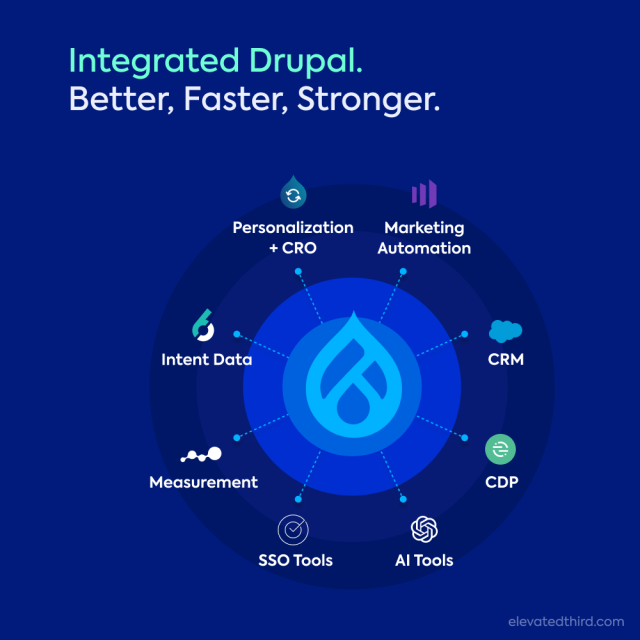
We integrate Drupal websites with your marketing technology tools to improve user experience: helping you achieve better results, flexibility, and growth. Count on us to guide you and provide Drupal web development services that support your marketing efforts for lasting success.
Scalable Tech-Enabled Digital Experiences
Different Drupal Solutions, same impactful results.
A powerful, out-of-the-box Drupal CMS tailored for simple use cases. Ideal for straightforward Drupal website needs without a heavy technical lift.
We’ve customized the Drupal core framework with B2B-focused modules to support marketing automation, personalization, and seamless digital experiences that drive conversions.
Great for marketers and site users to easily create landing pages without needing a developer—preserving user experience best practices.
Connected martech tools lead to growth.
Disconnected systems lead to missed opportunities, wasted resources, and fragmented customer insights. As a top Drupal development agency, we focus on linking your marketing technology platforms into a unified ecosystem. Effective connection boosts the power of your tools, improves website performance, and drives better results.
Whether you're using Acquia, Drupal CMS, 6sense, VWO, or other best-of-breed B2B marketing solutions—when your tools work well together, everything functions better. Using intent data and AI in your marketing, we can connect your systems and data to orchestrate smooth B2B customer journeys.

Drupal Development Solutions
Full-service Drupal agency experts helping businesses grow.
- Drupal CMS development and strategy on top technical foundations. We align with your B2B growth goals to create scalable and high-performing Drupal sites.
- Drupal Martech Integration with tools like 6sense, CDPs and CRMs like Salesforce to supercharge ABM, orchestration, and reporting.
- Digital Asset Manager (DAM) implementation for media management and performance, leveraging Acquia DAM to enhance web design.
- Headless Frontend Technology for fully decoupled Drupal development solutions, or a hybrid approach for Drupal-driven headless applications.
- Integrated web personalization with Acquia Convert and 6sense integration to deliver tailored user experiences and maximize engagement.
- Improve the Drupal website code for better ease of use, speed, and support and maintenance. This helps ensure long-term reliability and performance.
Drupal at the Forefront of AI in Web Development
Integrate AI for smarter, more dynamic digital experiences.
Drupal’s flexibility and advanced capabilities make it the ideal platform for integrating AI into your digital strategy. By combining our deep Drupal expertise with cutting-edge AI tools, we help you create smarter workflows, personalized user experiences, and data-driven insights.
What We Offer:
- AI-Ready Drupal Development: Leverage Drupal’s AI modules to integrate tools like OpenAI and machine learning for predictive targeting and content optimization.
- Enhanced Personalization: Use AI-informed intent data to deliver tailored experiences to your users.
- Future-Proof Solutions: Build a scalable, AI-ready foundation for your digital experience platform (DXP).
Explore our Drupal AI Readiness services to see how we can help you unlock the full potential of AI in your web development projects.
Don't settle for subpar Drupal. Demand the best.
The wrong partner can lead to bloated Drupal projects and websites, missed deadlines, and frustrating results. Many Drupal providers send projects to overseas developers without a clear plan. This leaves you to manage every step of the process.
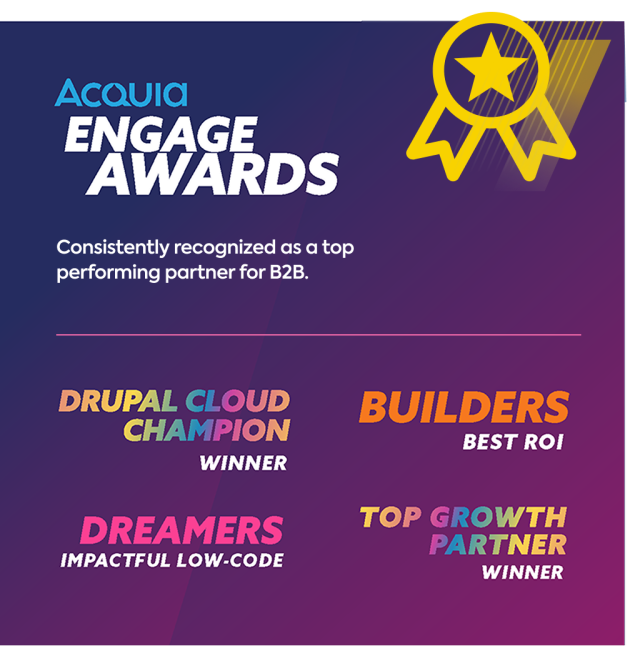
As a leading Drupal development company, we bring over a decade of experience as Acquia Partners. Offering Drupal website development services, we combine strategic thinking with technical execution to deliver clean, conversion-focused Drupal solutions that work—no compromises.

Questions & Answers
Drupal development services refer to the planning, building, and maintenance of websites using the Drupal content management system (CMS). These services can include custom module development, theming, integrations with marketing tools, performance optimization, and ongoing support.
At Elevated Third, we do more than just build websites. We combine smart planning with advanced Drupal and Acquia tools. This helps us create B2B websites that grow with your needs and focus on driving conversions.
Yes, Drupal works well with marketing tools like Salesforce, 6sense, and other popular B2B platforms. These connections help with account-based marketing (ABM), lead scoring, personalization, and automation.
At Elevated Third, we specialize in combining marketing technology with Drupal. We link your website to customer data platforms (CDPs) and customer relationship management systems (CRMs). We also connect to tools like Acquia, VWO, and 6sense. Our Drupal development services ensure these platforms work together to improve targeting, enhance user experiences, and promote growth.
Drupal CMS is a ready-made version of Drupal, perfect for simple content management tasks. It has built-in features that help you create and publish content quickly. This makes it a good choice for teams that need to work fast without a lot of extra setup.
The Drupal Framework is the foundation for building more complex digital experiences, such as Drupal 10 or 11. This allows for more customization, marketing automation, and connecting with tools like 6sense, Salesforce, and Acquia.
At Elevated Third, we choose the right approach for each situation. For basic needs, we use Drupal CMS. For more advanced B2B websites, we customize the Drupal Framework. This helps us create strong solutions that fit your marketing needs.
Drupal is different from other CMS platforms because it is flexible, scalable, and designed for large businesses. It can manage complex digital experiences, offers strong security, and supports headless architecture. It also allows for personalization and works well with marketing tools.
Yes, Drupal is a better choice for B2B websites that need to grow, personalize, and integrate deeply. While WordPress works well for simple content sites, Drupal provides an enterprise-level content management system. It can handle complex B2B needs, including marketing automation, advanced user permissions, and organized content structure. It's also a more secure solution.
When you work with a Drupal web development agency, you design your website for better performance and growth. A specialized agency knows enough about Drupal CMS development to create flexible solutions that meet your business needs.
At Elevated Third, a top Drupal development company, we do more than just build websites. We connect your website strategy with B2B marketing tools like 6sense, Salesforce, and Acquia. This helps you make the most of your marketing technology. Our Drupal experts focus on performance, personalization, and conversion optimization, leading to smarter websites that enhance account-based marketing, content strategy, and digital growth.
Choosing the right agency makes Drupal development a valuable asset, not just a technical task.
Unlike many Drupal development companies, we integrate strategy into everything we do. As a Drupal web agency, we focus on B2B success. We create websites that match your business goals, not just technical details.
As Acquia Partners, we have a lot of experience. This helps us provide flexible Drupal CMS development services. We design our services to grow with your marketing needs.
See how we start small and build Drupal roadmaps that scale.

